Dashboard
The Dashboard is the customizable section with charts that provide a vivid visual representation of the most relevant report data in one place.
It allows monitoring your customer's activities in real-time by providing visual charts on some most crucial information. Here you can find all the charts that were created in the Summary Report, Orig-Term Report and Active Sessions sections, and exported to the Dashboard.
To know more about charts, visit our How to create a statistic chart? article in Knowledge Base.
To start working with this section, please use the quick access toolbar (see the screenshot below):
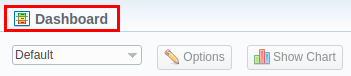
- In the section, you can have several Dashboards. To pick a target Dashboard, click on the respective field and select a relevant Dashboard (for example, "Default") from the drop-down list.
- To view the advanced settings, click the "Options" button on the toolbar:
- You can change the name of the respective Dashboard: specify a new name in the Dashboard name field, click "Save", and reload the page.
- To copy the Dashboard, click "Copy" and reload the page. Then, you will be able to select it in the list of available Dashboards.
- Also, you can remove any Dashboard. Simply select it, open settings, and click the "Delete" button.
- To add a relevant chart to the Dashboard, click the "Show Chart" button. Then choose the category of the chart (i.e., Summary Report/Orig-Term Report/Active Calls) and select the respective chart from the drop-down list. You could add several charts and use the vertical scrolling to browse the Dashboard.
warning
- Resellers and administrators have their own Dashboards. The created Dashboards while logged in the system as respective Reseller, will be visible only for this Reseller.
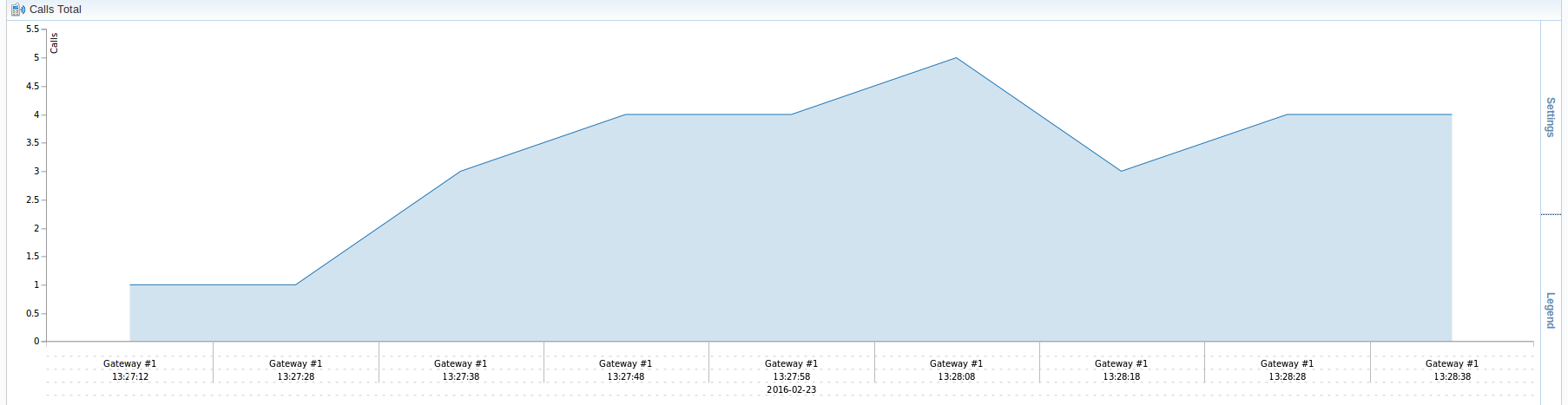
- You can plot in the chart only existing statistics in the report. It doesn't show time periods where there is no data. You can check an actual date interval by clicking the Info icon and it could be different from the specified interval if there is no data for the period.
- When you choose the Time parameters for the X-Axis (i.e., Year, Month, Date, Time) and there is only one period, the line chart will not display the data. For example, if you choose the Month option on X-Axis and the statistics are only presented for January, the line chart will be empty in this case.
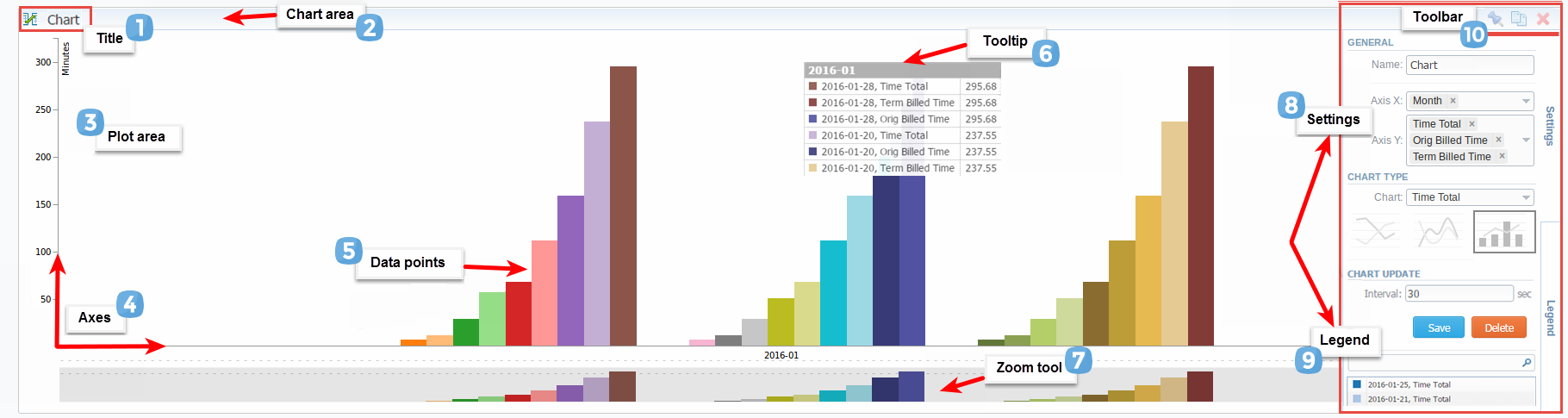
- General example of a chart
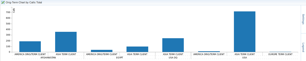
- Orig-Term chart
- Active Sessions chart